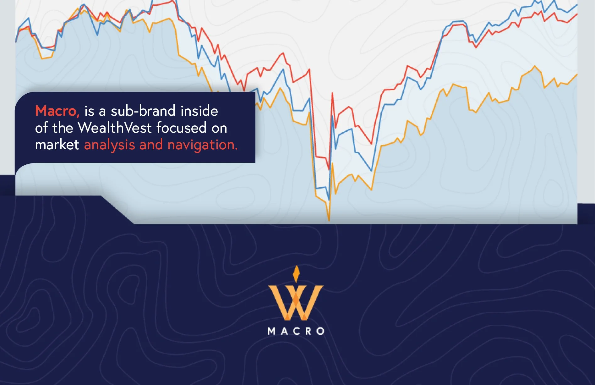
Macro, is a sub-brand of WealthVest focused on market analysis and navigation. The sub-brand is based in education. Its products are geared towards financial professionals to help them make decisions on how to help their clients with their retirement needs.
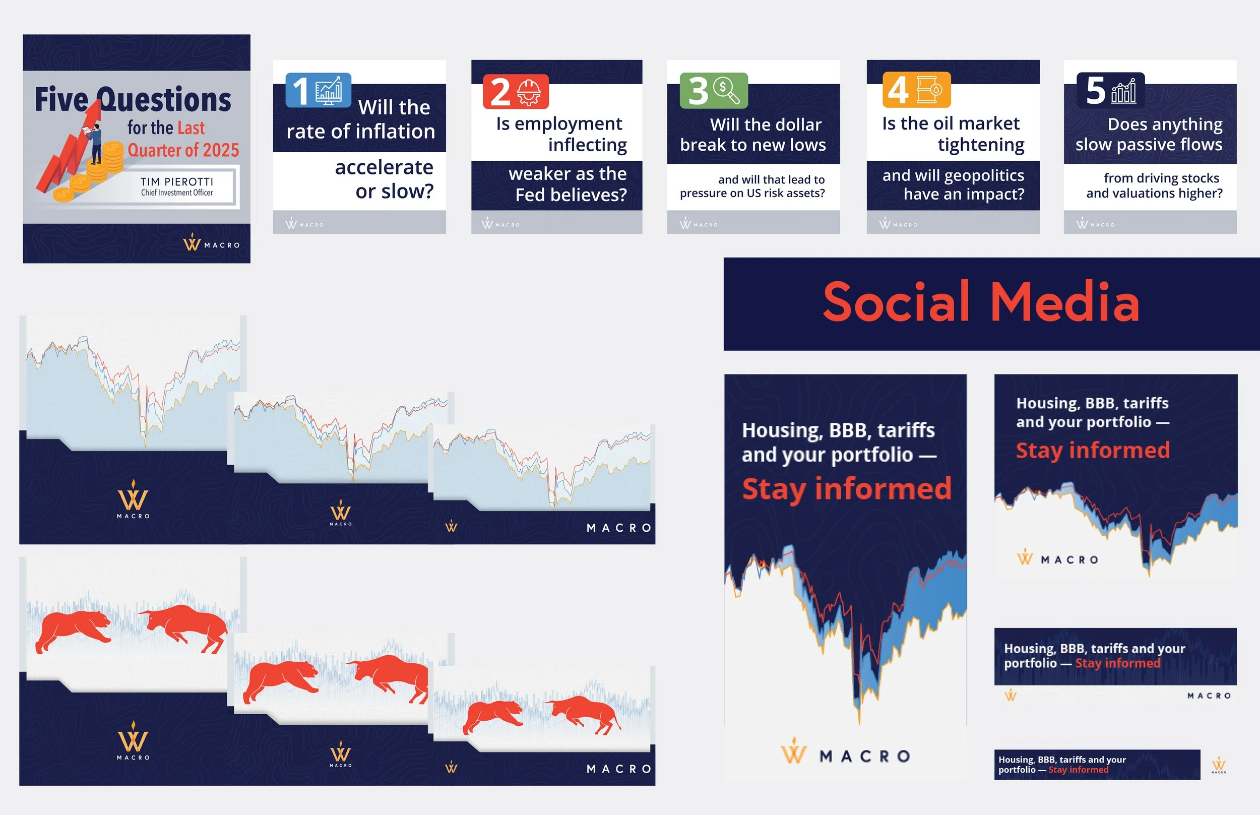
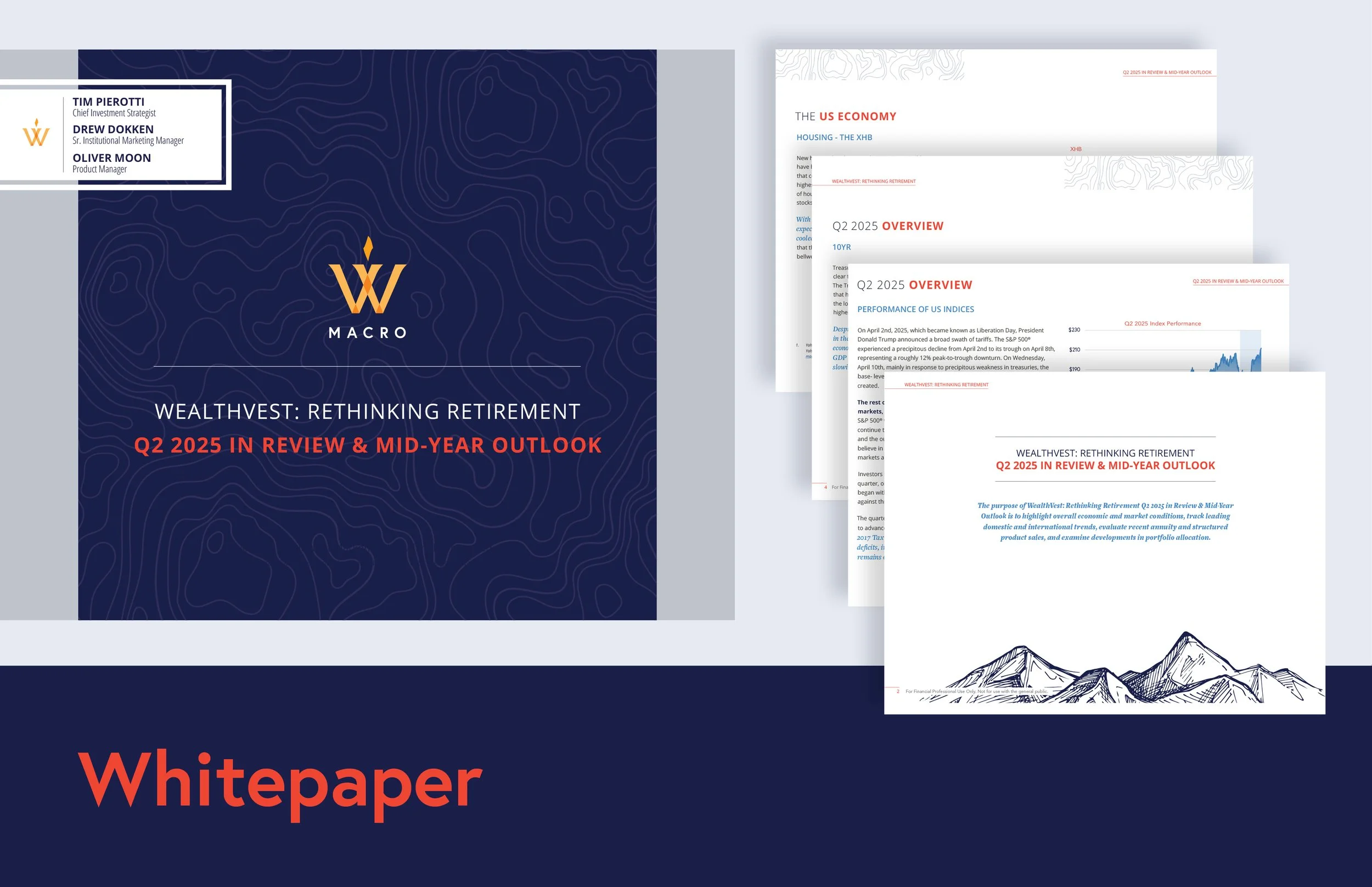
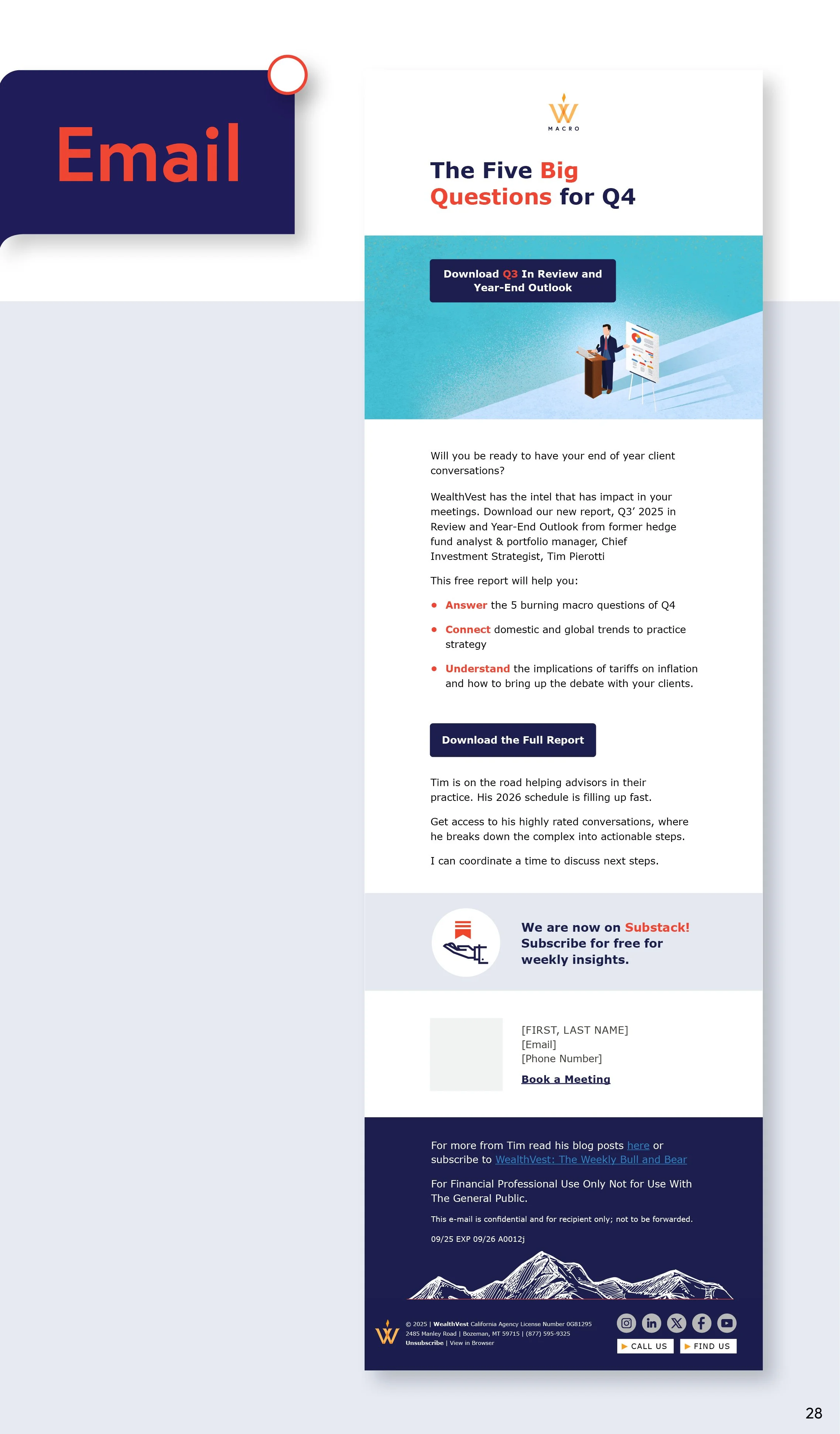
The branding utilizes topography as it’s main visual design. Topography relates directly to navigation. The idea being that Macro helps financial professionals navigate the complicated landscape of an ever changing market. The palette uses WealthVest navy blue, hot orange, grays, and WealthVest Yellow. These color’s visually contrast nicely but also communicate the idea of an alert, a notification, or an unmissable mark. This helps call-out the most important information and provides a bolder and louder aesthetic than its parent brand.
Quick Clips
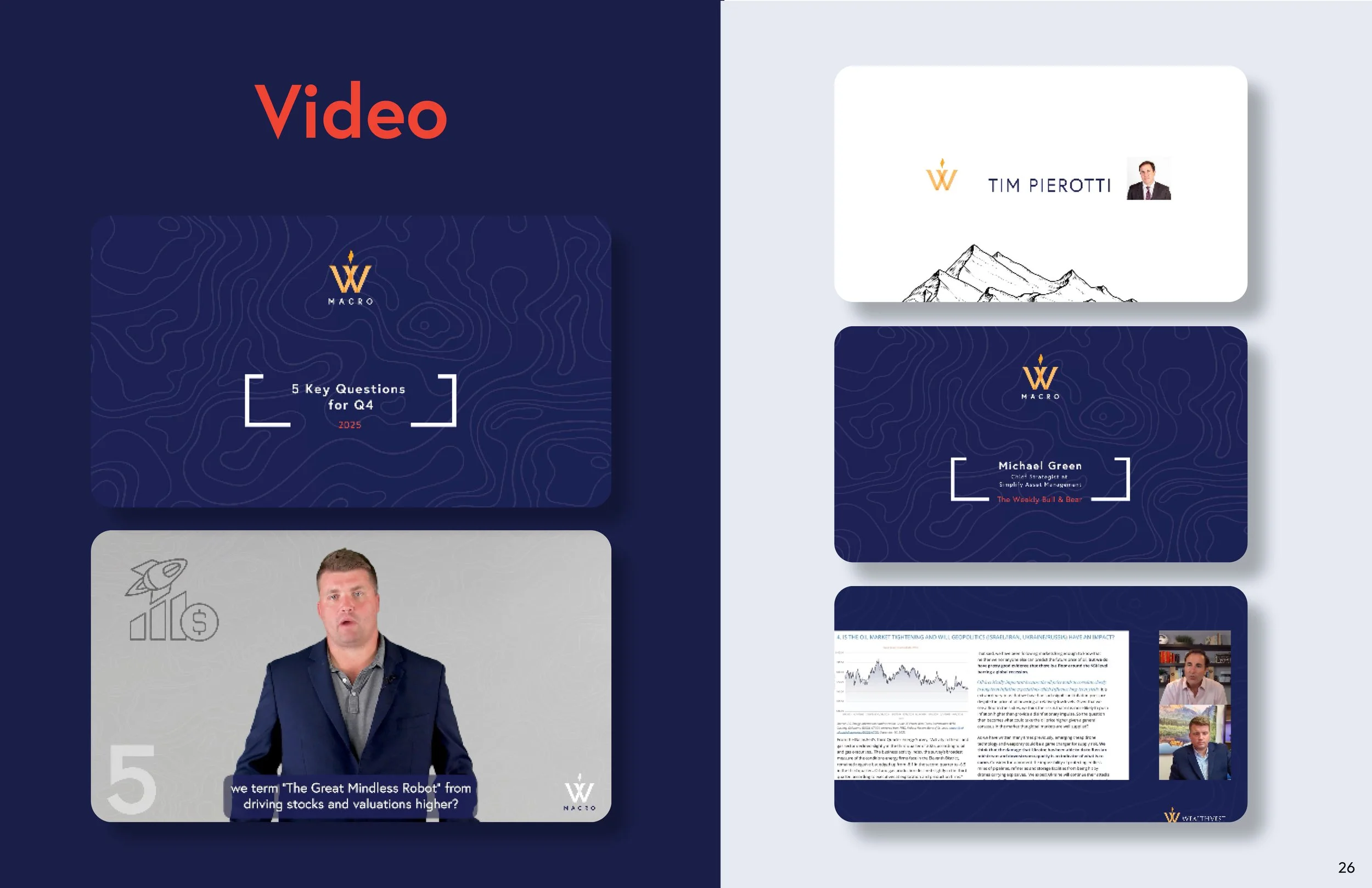
As with the WealthVest brand, I was lead on all video and audio post-production assignments. My responsibilities included cutting footage, color grading, green screen editing, script formatting, closed caption production, audio editing, building motion graphics for intro’s and outro’s, building motion assets to accompany information in videos, and designing custom audio assets.
Blog Promos
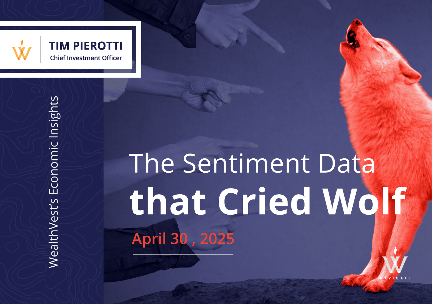
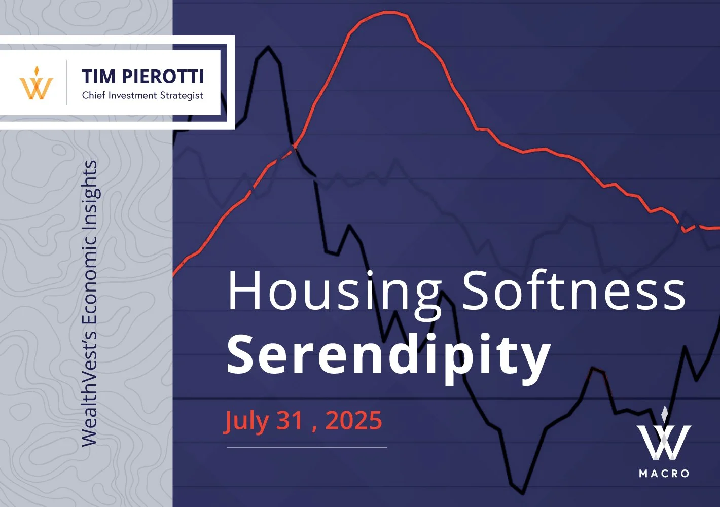
The Macro brand posted weekly blog posts on the most pressing financial subject of the week. Each post required a custom image to act as a headline and introduction to the content a viewer would be reading. For these posts, our team developed an image language that used Macro’s hot orange / red color to call out key elements of an image. We would receive a headline, then build a custom image. often times collaging various images together, and apply our color treatment to the main part of the image. This created a language that stood out on social media platforms as it is loud and assertive.